Executive Summary
Lee & Associates is a commercial real estate services firm with regional offices throughout the Unites States, British Columbia, and Canada. They offer brokerage, property management, valuation, asset management and financing. The firm is the largest of its kind in North America.
Lee & Associates desired to improve national brand messaging as well as maintain visual consistency for material being produced by independent branches across the country. Small Giants developed brand and style standards to execute a complete brand refresh.
Challenge
Each of Lee & Associates’ 50 independent branches in the U.S. is structured to allow owners and operators the liberty of idea originating, and producing and distributing their own marketing pieces to convey vital project information. Lee & Associates headquarters sought to maintain the unique freedom that their expert employees had come to love, but wanted to improve the overall brand message and aesthetic to reflect the innovation and leadership of the national resource. To achieve this, Lee & Associates needed a redesign that would reflect the brokerage firm’s modern approach, and they needed brand standards to ensure visual consistency throughout material and collateral.
Solution
Our team of in-house designers worked to bring the firm’s messaging and brand promise alive through contemporary materials and approaches. The need for a full brand redesign became apparent and offered the perfect opportunity to harmonize all efforts. The existing logo had represented Lee & Associates well for three decades, and therefore, they were challenged to achieve consensus from stakeholders for a change as significant as corporate rebranding. Because we understand that change can be difficult, we eased them into the idea with a few initial concepts. The approach worked, and through a full brand redesign, all of the materials and messaging compounded effectiveness.
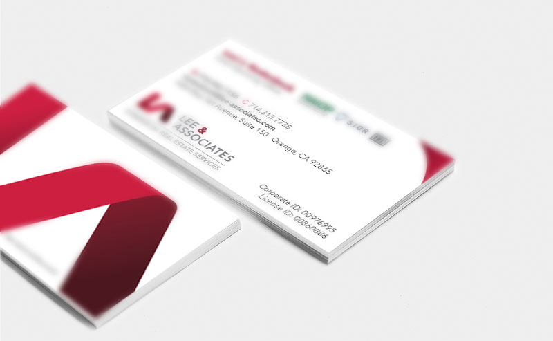
Updating a nationally trusted brand goes far beyond creating new materials and a style guide, which is why we made sure that Lee & Associates was fully equipped with a brand purpose and promise. Photos on this page represent print and digital material examples.
Result
The process and tangible results helped reinforce Lee & Associates’ perception as composed and trusted professionals with local expertise leveraging a national platform of resources. Dissemination of the restructured brand means that each Lee & Associates location can now produce material that will align with a corporate visual representation no matter where they are in the country.


