A 2015 Microsoft Corporation study found that the average person’s attention span is eight seconds, which is just one second shorter than that of a goldfish. Pair that with the significant increase in our ability to multitask, and many companies will find themselves with this challenge: In an eight-second window, how can we capture the attention of an individual who is checking their emails, listening to music and making a phone call? In this Q&A, our resident graphic designer, Cat, shares the significance of infographics in today’s bustling world.
In lamens terms, why are infographics important?
Before you can help an audience process information quickly, you have to get them interested in what you have to share in the first place. Everyone is constantly wading in the “noise” of marketing, and infographics can serve as a visual beacon by capturing attention quickly and visually setting your information apart from the rest.
What types of infographics do you wish you saw more of in the CRE and A/E/C industries?
I would love to see more companies using infographics to explain complex processes and procedures that are huge parts of their businesses. It can be helpful to audiences that don’t understand the industry, but also helps illustrate the company’s true expertise. Procedure infographics can be lengthy to produce, but often make the biggest impact.
What other topics can an infographic be used to explain?
Everything can be explained with an infographic. Infographics were born out of a necessity to communicate long or uninteresting data in a way that people enjoy and remember. Unsuccessful infographics only occur when there is a lack of simplicity or clarity, especially when there’s a lot of information to convey.
Briefly describe your process of creating an infographic.
When I start an infographic, I like being unfamiliar with the process that I am trying to explain because I get to experience the struggle that our client’s audience might have in understanding. This helps guide my design choices when I create the infographic to make it easy to understand. I start with these questions:
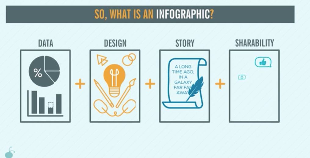
- What is the purpose and point of the infographic? What is the story?
- What kind of data supports the idea and needs to be communicated? (numbers, trends, processes etc.)
- What design style will best showcase this information? How can you design in a way to bring data and story together to make it easy for people to understand?
Infographics can range from the simple icon to a complex custom illustration showcasing multiple data points. This can be a lot of information to organize so when in doubt, less is more.
Let’s talk animation. What is the impact of bringing an infographic to life?
It’s like seeing your favorite story turned into a movie. Animated graphics are a huge hit in the digital age because of the share factor – an estimated 92 percent of people who view a mobile video will share it with others.
Click here to see a real infographic.